Try seven warm neutral decor ideas using texture, lighting, wood and a restrained palette. Work with the furniture, finishes and daylight your home already has.
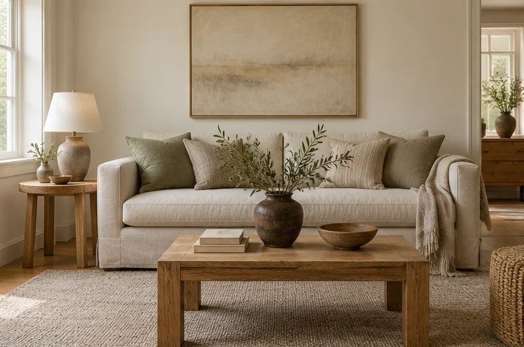
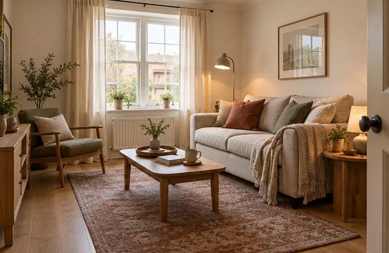
Neutral sitting room with honey oak, oatmeal linen and taupe wool
Warm neutral decor depends on more than choosing beige. Cream, brown, gray and muted natural tones change beside one another, so the useful starting point is the floor, furniture and daylight your home already has.
These warm neutral home decor ideas begin with the colors and materials already in the room. The aim is a restrained palette with enough variation to be interesting: a pale background, something substantial in the middle and a little depth. Warmth comes from those relationships, as well as from the objects themselves.
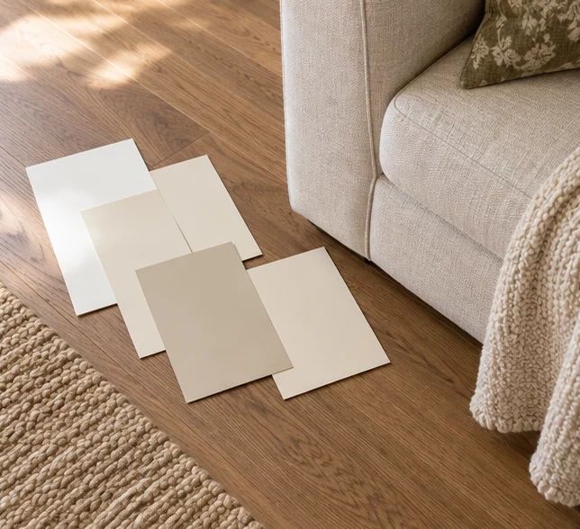
Gather the fixed finishes into one comparison: a floor sample if available, a photograph of the countertop, a cushion from the sofa and paint cards viewed in the room. Turn on the lights you use in the evening. A phone photograph can reveal broad contrast, but screens alter color; make the final decisions with physical samples beside the actual surfaces.
Start with the surface you are least likely to replace, such as flooring, a tiled fireplace or the sofa. Does it seem yellow, pink, greenish or blue-gray beside a plain white reference? Undertones are relative, so put possible partners directly next to it rather than judging each sample in isolation.
Benjamin Moore's neutral guidance explains that warm neutrals can carry different undertones and should be tested under different lighting conditions. That is a useful method, rather than a recommendation to buy a particular paint. A warm white that looks gentle alone may look yellow against cool tile or slightly dirty beside a brighter white cabinet.
Try larger movable samples in more than one position. Look in morning light, in the room's dimmest period and under evening lamps. If two existing finishes disagree, choose a connecting textile containing both families instead of adding a third unrelated neutral. Keep the sample until the replacement item arrives.
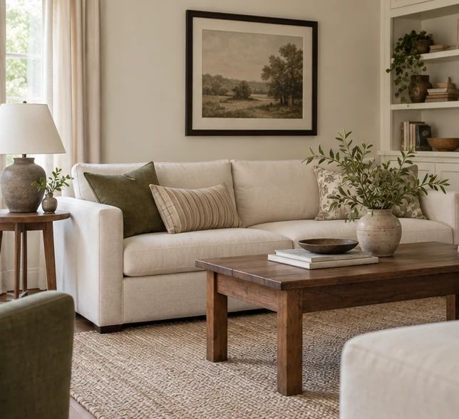
Ivory sofa, oatmeal rug, mid-brown coffee table and dark picture frame in one room.
Use differences in depth to make a neutral room legible. An ivory sofa against ivory walls can merge into one pale block. An oatmeal rug, mid-brown table and dark frame give it a setting, even though the room remains restrained. The useful question is how clearly you can distinguish the major shapes.
Lay fabric and material samples together from light to dark. You do not need a rigid percentage formula, but it helps to choose one dominant pale area, a middle value and a few deeper marks. Existing furniture can supply these roles; there is no requirement for three new purchases.
Avoid matching every cushion, curtain and rug to precisely the same shade. Different materials reflect light differently, so an attempted exact match can become a collection of near misses. A deliberate variation is easier to maintain and usually looks more relaxed. Repeat a tone in a second small place when a new piece feels isolated.
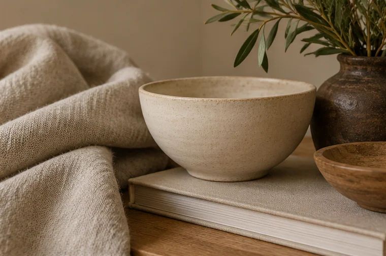
Linen, off-white ceramics and wool against a honey oak surface
Choose one broad texture you can see from the doorway and a finer one you notice close up. A woven rug may provide the larger pattern, while a slubby cushion cover or ribbed ceramic gives the smaller detail. This creates interest without relying on a shelf full of decorative objects.
Use texture in functional places: linen-look curtains that soften glare, a comfortable wool or cotton throw, a basket for a real storage task. Compare the surfaces together. Several coarse materials can make a room feel visually restless, while a smooth table or plain cushion provides a useful pause between them.
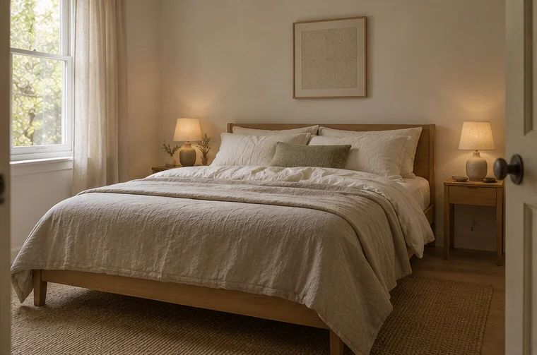
Consider maintenance before choosing heavily textured fabric. Loose loops can snag, deep pile may be awkward beneath a dining chair, and delicate covers may not suit frequent washing. Warmth is partly the ease of using the room. A simpler durable weave often supports that better than a luxurious-looking material you have to protect constantly. In a bedroom, apply the same restraint through comfortable bedding, wood and useful bedside light.
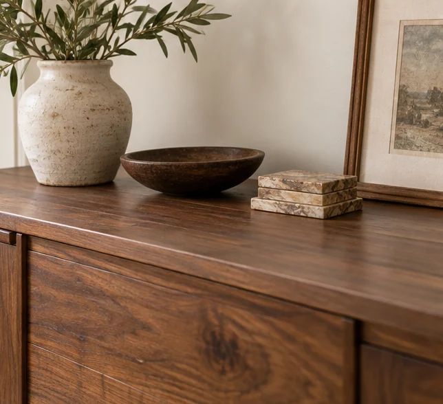
Clear walnut cabinet top with visible natural grain against cream wall.
Wood can provide the middle or darker value in a pale room, along with grain that changes across a surface. Work with an existing table or cabinet first. Clear enough of its top to see the material; covering every wooden surface with trays and textiles hides the variation you were hoping to introduce.
You can combine different woods by looking at their broad warmth and intensity. A quiet honey-colored piece may sit well with a deeper brown frame, while a very orange finish may need more space around it. The species name alone does not predict color, because stains and finishes change the result.
If a room is already dominated by warm timber, balance it with cream fabric, muted stone or a dark accent instead of adding more wood automatically. Small practical pieces are enough when you need a repeat: a stool used as a side table, a frame or a tray for everyday items.
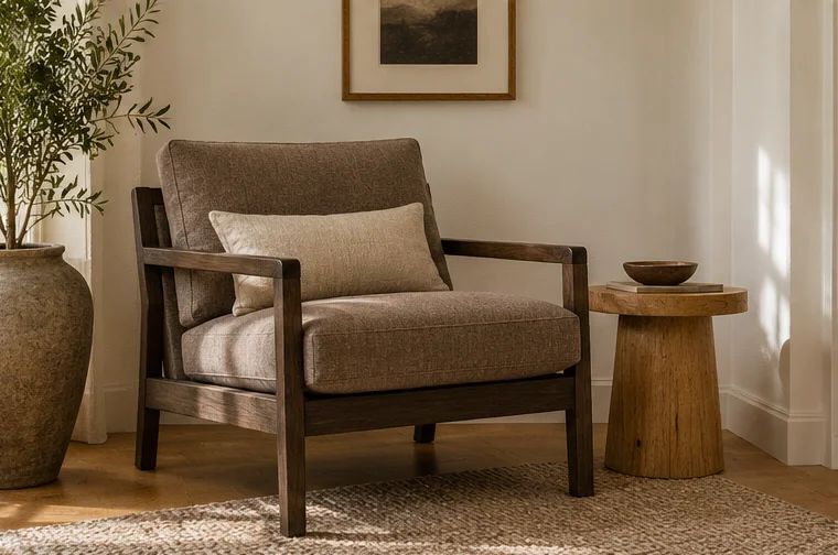
Dark wood chair frame against warm taupe upholstery
A little dark contrast can make a neutral room feel more defined. Try a charcoal lamp base beside a cream wall, a dark brown picture frame above a pale cabinet or an ink-colored stripe in a cushion. These marks help the eye read the room's arrangement without introducing a strong new color.
Begin with one dark object you already own and move it between possible locations. If it looks stranded, repeat a related tone in a smaller piece elsewhere. The repeats do not need to match exactly: a dark wood table and a blackened metal frame can share enough depth to feel connected.
Avoid outlining everything. Black curtain rods, frames, lamps, table legs and cabinet pulls can become a grid that dominates a small room. Choose the places where definition is useful, then let other edges remain soft. A warm deep brown is worth trying if stark black feels too assertive against the existing palette. For a small lounge, connect the palette to the furniture and rug with these practical living-room ideas.
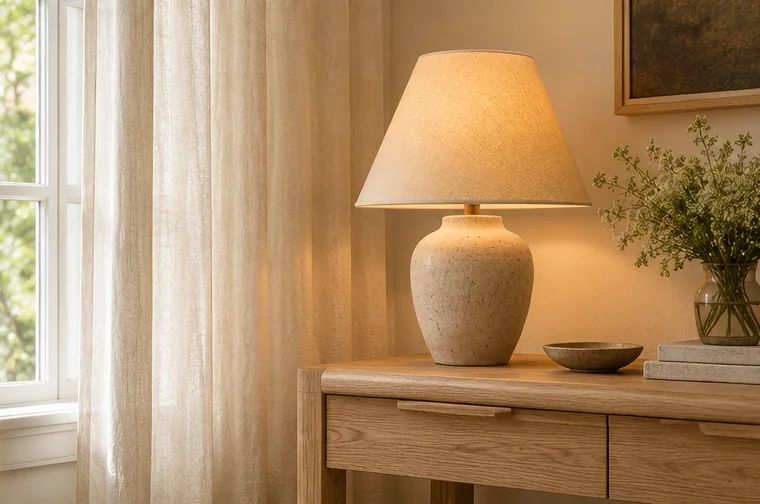
Off-white curtains and shaded lamp beside a pale oak table
Lighting changes how neutrals appear, so test a bulb beside your actual finishes before buying several. A warm white source may make cream and wood look comfortable, but an extremely amber bulb can muddy pale colors and make a reading corner less useful. More yellow is not an automatic improvement.
The Department of Energy distinguishes the light's color appearance from its effect on object colors. Color temperature and color fidelity therefore answer different questions. Brightness is separate again. Read the packaging and use a bulb suitable for the fitting, then judge the result from the positions where you sit and work.
Avoid mixing conspicuously different white light appearances within one small seating area unless the different tasks justify it. A cool exposed ceiling bulb above very amber table lamps can make the palette look inconsistent. You can keep practical task light bright while using shades and placement to reduce glare and create gentler evening pools of light.
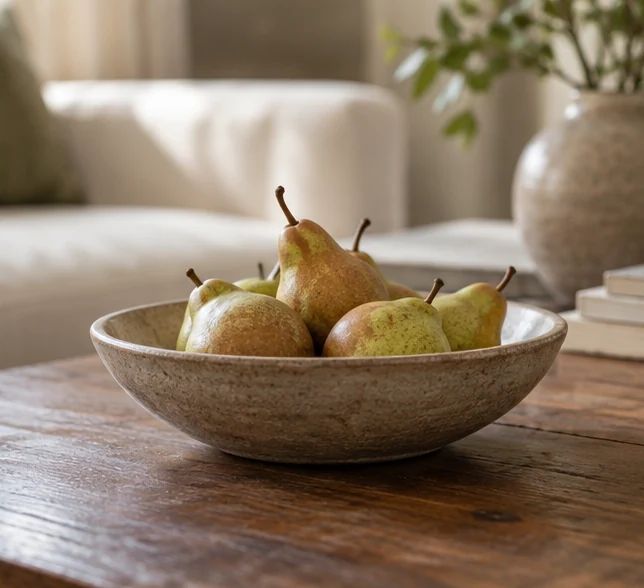
Low bowl of pears standing alone on a neutral living-room coffee table.
A branch in a stable vase, a small leafy plant or a simple bowl of seasonal fruit gives a neutral room an irregular shape. That variation can be more interesting than another symmetrical ornament. Choose the object for the actual surface and the care it needs, rather than filling every empty patch with greenery.
For a plant, assess the available light and select accordingly; a dim corner is not improved by a struggling specimen. Keep water away from unprotected wood, and check suitability where pets or children may investigate leaves. A dry sculptural branch or an unplanted ceramic form may suit the location better.
Let the detail stand alone with a little space around it. On a coffee table, a low bowl is easier to use around than tall stems that block conversation. On a shelf, one naturally varied object can sit beside a plain stack of books. The room should still have somewhere to put down a glass.
Change the relationship that is causing the problem before adding another neutral object. Compare undertones, give pale areas some depth and test the evening light. Once those decisions agree with the fixed finishes, a few useful textures will do much of the remaining work.
Build a warm minimalist bedroom with comfortable cotton or linen bedding, wood, layered lamps and storage that fits, while keeping the room easy to use.
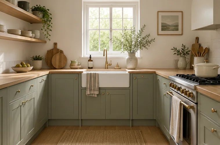
Choose sage green for your actual kitchen light, then pair it with warm whites, wood or a small set of accessories, including practical rental-friendly options.
May we use Google Analytics cookies to understand visits and which ideas readers find useful? It is optional. You can change your choice below at any time. Privacy details